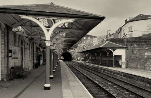
Guest - Nov 18, 2006 06:28 AM EDT Thanks Mike, glad you liked it! And you're right Beverly, it does seem to look more B&W than sepia - but I think this is all about colour management and screen profiles. I made the "sepia" colour up myself using the GIMP colorize plug-in, and I should have added a bit more red to the mix - although it seemed more sepia when I did it than it does now. I also used the channel mixer to alter the relative amounts of the RBG channels (more red, less blue) to give the shot this kind of antique look.
Steve
Guest - Nov 18, 2006 03:54 AM EDT thanks steve this is better b&w does add to its characetor (spelling not good)
Guest - Nov 18, 2006 12:03 AM EDT NIce converging lines. But on my screen it looks more like B/W.